 |
| Finished Sketch with two colors layered in with the color filter to absorb the shading. Outside of the white, which is the background color, I picked a single orange to make the focus and added its inverse to shade everything else. |
 |
| Original. |
|
| Finished Sketch with two colors layered in with the color filter to absorb the shading. Outside of the white, which is the background color, I picked a single orange to make the focus and added its inverse to shade everything else. |
|
| Original. |

 |
| Series of different sized polka dots blurred stretched and resized. |
 |
| Copied original layer altered size used a difference filter, offset layers. |
 |
| Repeat previous step. |
 |
| Repeat previous step and add in a cool blue layer to absorb the additional red hues |
 |
| Mirrored Variation I |
 |
| Mirrored Variation II |
 |
| Mirrored Variation III |
 |
| Mirrored Variation IV |
 |
| Add complementary color swirls with slightly different transparency. |
 |
| Blend Variations and combine with the color swirl for added tones. |
 |
| I had fun making this shot from a single picture as we were crossing the Throgs Neck Bridge |
 |
| Straightened and cropped with the bridge blacked out. |
 |
| Original |
No camera can take this picture. This is a merger of a single photo that was shifted across the spectrum to emphasize the contrasts that we normally do not see in the upper and lower ranges of light.
Enjoy!
 |
| Final Product |
Steps to recreate...
 | ||
| (1) Original |
 |
| (2) Use the Levels tool to focus on the lower end of the spectrum at the cost of washing out the sky. |
 |
| (3) Use the Levels tool to focus on the higher end of the spectrum such that the normal visible range is quite dark. |
 |
| (4) A gradual transparent erasure of the sky region from the over-exposed ground picture. Layer that on top of the understated sky picture for the final result. |


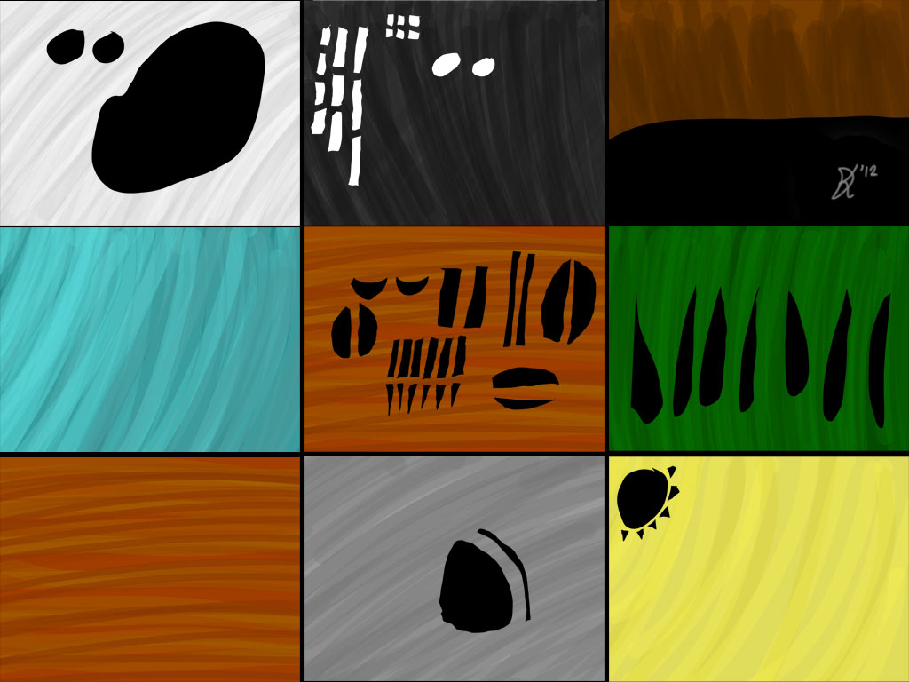
 Find an edge of each of the scribbles and pull it out with the smudge tool with a single stroke.
 Using the edges of each of those smudge the strokes further.


 The stars were the exact opposite.
 Example of showing a close to full gradient from White to Black


 Step 3 (3 yellow layers + background)
 Result


